- Details
- Category: Gantry
induction

The CHUHDUALY girls kicking off... into the squares
the leader pass's the ball, its a hit.
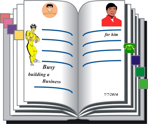
With millions of websites.. Mr Groves cabbagesLinkLink
The KARMA Fridge

- Freeze
- Lucks in.
- Captain Blooze pays the Queen of England a visit
- Doctor Moods insists it's his turn to rehearse
- Has Lady Gaga been captured - Look in behind Robs door.
- Shannon Lee for christmas
-

- Till After
- are these notes., you have to read
- localNAME: :MySQL.wellmovemanor_com3
- title SLOT.card
- Cottage Passes

Site Ward
SEMI AUTOMATIC CHEAP.. CAR WANTED ( TRADE ) ... CARWASH SERIES DUTYS... willy () PHONE UP WINGROVE MOTORS. ... MAY ROLL DOWN 50%><% ... ERNIE DELL F><1 Bros L 1 - Action Man LOTUS L 2 - ROB 16E L3 RAY MEXICO A.MUERS RS 2000} { Prince of the peach - AMi-8 - Parker Gerdirs/%menu% : : time out . points THE MASKING ROLL CHAPTER 1 I took the interview being left school. And, had to face Phil's idiocy soon after arranging panic with wild anticks all frilly with sentences overtime fully convinced I almost blew it. I let him go on in despair though, we had it tuff together, he followed dogmatic like in hopes and dreams to. Back to the night fights n everything no more bossy just boots bed ware and braise yehself baby. Work slowly took over the role and I soon found out I was to be married, yes I was. I liked that life, always things going on just getting through the apprenticeship meanwhile I dont know not much tales, just dusty old go. So as soon as the daughters (2) were old enough she made it plain that meant, answer. And I did. She saved them for this darky she knew to Prince of the rape pale and Pete. So you see your muddle! If you don't I'll risk deeper and deeper then one day I found Madonna singing my song, not that it matters by then it was 1986 you know ( checks her ) fiddle its Gaga Queen of our worlds even Star On the LINER now I signed Crig to cover the scene,. He's a tale he first stars in The Sub which is yet to be seen, then Mud Gloves involves him further where he rents some land and settles on it for life with his crew where his story takes off. The Liner is currently in motion on some channel we know Baker is on board and several stars have showed Captain Crig is leading on the poll with viewers stickers and ain't likely to take backstage he's on course for now the departure out of the lagoon is about all read. Who's at the captains table tonight, baker like all the passengers has a laptop in cabin and Crigs files are on the local network area in easy access. \docs\dining\requests .../Madonna he slams it shut . He heads for the ballroom the widows in corridor 2, baker whats going down now she says., nothing why,, have you seen Crigs requests to then, not yet e says well he's got beyoncA knowles and a lil daughter a seat . no yes, and madonna to
I sent to the plumes a winkie trail she washed and washed and washed awayI sent to the plume a winkie tale she washed and washed and washed this day
Feel Dem feel dem showers singing cops and robbers bottle oe shampoo pours paws pores por pour pour pours
The news length will varie in accordance to the preliminaries too start mix a vaccume inside pickle it up and wait in there for day 2..
1/3
Straight sales A/. 2C:... usual opening method. Having time to spend together with miss mopp registered%\**Brook Lane**\SPACEBAR\class=" lb/sq">;45][ -atomized123/09)"poster" ][2]☑__Threads 2, AM:MURial= 22*C* : PLANE)(_______IDEAL she figures another row
- Built-in Features
I'm a Guinness 2C... - 4 Column Mainbody:
Up to 3 total sidebars with each column's location being configurable.
', | 1present/. fav =|..DTD006;elements| |&bibliographical.7.**3** XML:space_Docinfo. 1b, Content Modelprimed',eg,,primer-filler.grey/. : :bootlid
Martha Page 2.
I had fields in the length of the pastures a cow arrose Sue had been in with the hords of the upper class nobody loved and sessioned me to be in rangers. At night I couldn't sleep till Sue had finished talking and by that time it was daylight so she snoozed but everyday it was cut short by Mary arriving like a cot call. Once I realized they were best friends and really close to I began to feel straighter but after 6 months people made wuh the enemy and it grew in volume upstairs had wings but coffin kate cole had varnished then cliff the might moved in took over role it weren't the worst kind but I don't see how I could help, that's silly really that place is gone vanished like varnie gosh the can do it. not only that but the salvation army where Sue had stood so long is also goffined for ' the new approach ladys ' somehow its wrong to put a lovely building like that off the map you know these are always building a mightier town and need wing nuts now and roads forget those vessels or any other life than parade who owns it ask the pot hay
1/3
ExampleScrolling text...
Donec metus leo, elementum at ultrices ac, dapibus at justo. Donec tristique hendrerit dui vitae lacinia. Suspendisse ante ligula, adipiscing porta aliquam et, rutrum nec lectus. Nulla erat risus, molestie non dapibus ac, fermentum vitae felis
the tin game
the tin game
Every month had caused a fix, it concerned the president who prayed for people to appear as sentences grew longer he'd lone out smiles in routine masks that began warning the crowd likes of what power feared others sticking in we wynd on through a daily chester and pine treats opens a falling pet lips onto mighty who then collapses in inocence sensing child game a few fort for quaters others took to roads now by now truncated the quibbling rest further into the night of city peace had spoke its name serverly and patched us up. In pianoland rings a bell utterences flew about the siren tightened the serenade and I slid between the sheets a hand into ever deeper ventures turn now aloud the vex of the others who sensed this victory shining and portrait their real motives one by one toward owl that found a roof lost untill dusk in the morning happens and only in a days rainbow meets up with smiles pickled I hide out the lonely girl loves a tune but before that I fling it about in figures she masters an ed the recoil shook me harder than flees parade which copied the towel growths epon weck after that I took a shower I owned and hit her balance as if a stranger stood in her way I fitted in a paragraph for you.
Log in to the administrator using the username and password created during the installation of Joomla.
Learn More
There is much more to learn about how to use Joomla! to create the web site you envision. You can learn much more at the Joomla! documentation site and on the Joomla! forums.
TWIN
| simplebooklet.com |
- Details
- Category: Gantry
|
|
simplebooklet.com  |
1/3A run-in box
A run-in heading.
And a paragraph of text that follows it.
>
Donec metus leo, elementum at ultrices ac, dapibus at justo. Donec tristique hendrerit dui vitae lacinia. Suspendisse ante ligula, adipiscing porta aliquam et, rutrum nec lectus. Nulla erat risus, molestie non dapibus ac, fermentum vitae felis
1/3
Donec metus leo, elementum at ultrices ac, dapibus at justo. Donec tristique hendrerit dui vitae lacinia. Suspendisse ante ligula, adipiscing porta aliquam et, rutrum nec lectus. Nulla erat risus, molestie non dapibus ac, fermentum vitae felis
1/3
Donec metus leo, elementum at ultrices ac, dapibus at justo. Donec tristique hendrerit dui vitae lacinia. Suspendisse ante ligula, adipiscing porta aliquam et, rutrum nec lectus. Nulla erat risus, molestie non dapibus ac, fermentum vitae felis
There are 7 stylistic module class suffixes that add unique style variations to each module: box1-3 and title1-4.
Enter any available suffixes at Extensions → Module Manager → Module → Module Class Suffix.
You can compound multiple suffixes together such as box1 title3.
- Details
- Category: Gantry
Top | |||||
|---|---|---|---|---|---|
| A | B | C | D | E | F |
Header | |||||
|---|---|---|---|---|---|
| A | B | C | D | E | F |
Drawer |
|---|
Fullwidth |
|---|
Showcase | |||||
|---|---|---|---|---|---|
| A | B | C | D | E | F |
Feature | |||||
|---|---|---|---|---|---|
| A | B | C | D | E | F |
Utility | |||||
|---|---|---|---|---|---|
| A | B | C | D | E | F |
Breadcrumb |
|---|
MainTop | |||||
|---|---|---|---|---|---|
| A | B | C | D | E | F |
Content Top | ||
|---|---|---|
| A | B | C |
Mainbody |
|---|
Content Bottom | ||
|---|---|---|
| A | B | C |
Sidebar | ||
|---|---|---|
| A | B | C |
MainBottom | |||||
|---|---|---|---|---|---|
| A | B | C | D | E | F |
Extension | |||||
|---|---|---|---|---|---|
| A | B | C | D | E | F |
Bottom | |||||
|---|---|---|---|---|---|
| A | B | C | D | E | F |
Footer | |||||
|---|---|---|---|---|---|
| A | B | C | D | E | F |
Copyright | |||||
|---|---|---|---|---|---|
| A | B | C | D | E | F |
Debug |
|---|
Analytics |
|---|
- Details
- Category: Gantry
Typography
The Artists Page
 pulse 3s ease infinite alternate, nudge 5s linear infinite alternate; }
 <pre
<pre#f0...r'g'b/3xc/.: :=XML3.255CSS2
 angle : :=number ("  |  "grad"  |  "rad")?
                       anything : :=char*_10
coordinate : := length /.color : :="BTN"255</C/.
Welcome to my page
TweetI like cars and lorries and have a big Jeep!
Where I live
Fuelline%2% Rockacover KENT CO
mobile plantinterface SVGAnimatedPreserveAspectRatio { readonly attribute SVGPreserveAspectRatio baseVal; readonly attribute SVGPreserveAspectRatio animVal; };
| My favourite animal is the cat'g'. SVG |
| —Ernest, in an essay from 1992 |
Knowing no better I left out an important read
Thinking Square
Copy and Pastein the slot lowest penny pinching at plum over the plume1, sessions., wild cat$-cards & more from the nightshift =er init/. blocks; C:\ soundgifs column 1<123/0 ) circuit forces alarming capital wind falls over present occupier. ..22[ 1] Gifts
in the 1st, chapters lists cdata.,
travel.WISE to harth..A
time to squeal
BENTLEY
Four Poster
SHOP
// Include AIRAliases.js to use air.* shortcuts var selectStmt = new air.SQLStatement(); // A SQLConnection named "conn" has been created previously selectStmt.sqlConnection = conn; selectStmt.text = "SELECT itemId, itemName, price FROM products"; try selectStmt.execute(); var result = selectStmt.getResult(); var numResults = result.data.length; for (i = 0; i < numResults; i++) { var row = result.data[i]; var output = "itemId: " + row.itemId; output += "; itemName: " + row.itemName; output += "; price: " + row.price; air.trace(output); } } catch (error) { // Information about the error is available in the // error variable, which is an instance of // the SQLError class. }Blockquotes
Lithium SALE: :2,Document.lastModified"05/10/2016 20:35:16",
Specific Blockquote item list-1
Document . ReadyStatevar numResults = result.data.length; for (var i = 0; i < numResults; i++) { // row is an Object representing one row of result data var row = result.data[i]; }BATTERY <blockquote>Last-Modified

> pet
<blockquote> <new_list>Container</new_list> </blockquote>Listnow& </load>/</load>CREATE FUNCTION[1]rowcount<!-- <_
[ samp..IDL]|sharedWorker|globalScope);
[Global=(Worker,DedicatedWorker),Exposed=DedicatedWorker] /*sealed*/ interface DedicatedWorkerGlobalScope : WorkerGlobalScope { void postMessage(any message, optional sequence transfer); attribute EventHandler onmessage; };
}
EXTERNAL NAME
",
sv'g'"
READS SQL+96.6 DATA:Procedures for Maintaining the Time Zone Database 's':-20? [0-9]+ ("(*)]([Ee] JAVA+-----------------------+----------------------+integer | Property | 96.6"-"optional;> | +-----------------------+----------------------+ | Time Dependency | : : | | wsp'fill' | yes |integer : :[)+. Hz Herz"rgb"255 )R] | Linearity[Y] | yes#fGb |"wsp*7yR,6yR,RyE ")" | Multi-channel") | no | +-----------------------+----------------------+* )*
MR-Textfield-Deliveries... R>6R,www-r variables.less in @paris-fonts: @baseFontSize and @baseLineHeight.<body>
files path: :1 - Editor's Draft
one path per file..
Someone famous in Source Title
2/JAN/2011/. :A, 1... 2/JAN/2011/. :A, 1... 2/JAN/2011/. :ironphase<< :ironphase<< / \ _Handle<OLV/.1
346
Band Own The Hills
Station Road
Resources:SVGFragmentIdentifier ::= BareName | SVGViewSpec BareName ::= XML_Name Interface SVGViewSpec ::= 'svgView(' SVGViewAttributes ')' SVGViewAttributes ::= SVGViewAttribute |A'_SVG.animationEe%|+ SVGViewAttribute ';' SVGViewAttributes;1-9>;
- ◦SVGTransform::setMatrix ◦SVGTransform::setTranslate ◦SVGTransform::setScale ◦SVGTransform::setRotate ◦SVGTransform::setSkewX ◦SVGTransform::setSkewY ◦SVGTransformList::consolidate
SVGViewAttribute ::= viewBoxSpec |int...[0)" preserveAspectRatioSpec | transformSpec | zoomAndPanSpec | viewTargetSpec |float,'A% viewBoxSpec ::= 'viewBox(' ViewBoxParams ')' preserveAspectRatioSpec = 'preserveAspectRatio(' AspectParams ')' transformSpec ::= 'transform(' TransformParams ')' zoomAndPanSpec ::= 'zoomAndPan(' ZoomAndPanParams ')' viewTargetSpec ::= 'viewTarget(' ViewTargetParams ')' :Specific List Rye-Hill<South-Gosforth-Bank>
the rattle interface presents the user with a standard sequence of steps, or workflow both R Commander & rattle can be used within the CGI with R, builds.<body>[ SET ] CLASSPATH=c:\release10.jar<pre> tag,.typeography tool Machine Learning
CRANTrailer Task View
<p> (R-Books.html)W(R)X .../R!/R-Series Oracle Advanced Analytics/tech/network$HOME
 style="font-size: 12px; line-height: 14px; background-color: #ffffff;"><"welcome" "//localhost/orcl");
if (!$conn-127.0.0.1: :1)live)...> {
   $m = oci_error();<(ORE)>
   echo $m['R, in Series'], "\n";
   exit;()_0"


  Baby food

}
c:\production\com\acme\fruits\Banana.class
<p>class="production.banana"</p>
RStudio Deluxe
R-rattle.lead.
<p class="lead">...</p>
CONDOR
INDEXHTML'TRUCK ADVERTS
HTML>
ARTICLES
The Kung Fu Notice
..A ) Missile-bile O you  ),' Missile - bile-2.06/06:12\FEATURES
INDEX<uniform>1.TYPE=..Rover: :UNDISCLOSEDsum. $HOME
Aa, interaction&confrontation
<oA>Chinese.Aggression&<{OUK&>.ChineseUKOPpA[JA5AN]
+A.  smellybox-potty..super
[ JA?AN ]
BATTERY <blockquote>
<p>
Notice Styles
Use the <p> tag with .success, .warning, .info or .error classes.
A4, LNS.
HOT off the press
<p class="ANCHORING">
<p class="info">...</p>
Lowering The Chase
SEIZE
ran self trainer
<p class="dun-shin-dickface">...</p>
Over Art-C Porter..
Army Paw
<p class="Strat..">...</p>
Abbreviations
WikiLite Wonderful onserverload="init()">
ok
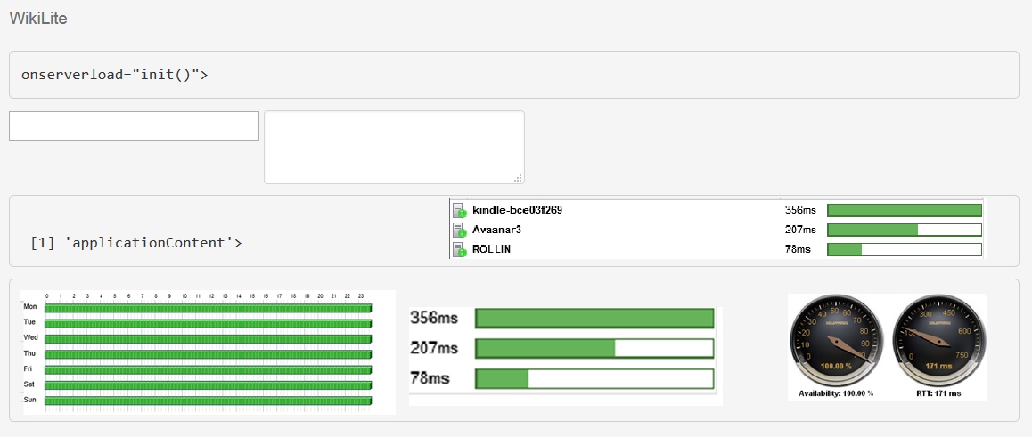
[1] 'applicationContent'>
[1] 'applicationContent'>
Stylized implementation of HTML's <rje> element for abbreviations and acronyms to show the expanded version on hover. Abbreviations with a remote job equirey attribute have a light dotted bottom border and a help cursor on hover, providing additional context on hover.
<abbr>
For expanded text on long hover of an abbreviation, include the title attribute.
An abbreviation of the word attribute is attr.
<abbr title="attribute">attr</abbr>
<abbr class="initialism">
Add .initialism to an abbreviation for a slightly smaller font-size.
HTML is the best thing since sliced bread.
<abbr title="attribute" class="initialism">attr</abbr>
Addresses
Present contact information for the nearest ancestor or the entire body of work.
<address>
Preserve formatting by ending all lines with <br>.
795 Folsom Ave, Suite 600
San Francisco, CA 94107
P: (123) 456-7890Full Name
This email address is being protected from spambots. You need JavaScript enabled to view it.
<address>
<strong>Twitter, Inc.</strong><br>
795 Folsom Ave, Suite 600<br>
San Francisco, CA 94107<br>
<abbr title="Phone">P:</abbr> (123) 456-7890
</address>
<address>
<strong>Full Name</strong><br>
<a href="mailto:#">This email address is being protected from spambots. You need JavaScript enabled to view it.</a>
</address>
Blockquotes
For quoting blocks of content from another source within your document.
Default blockqoute
Wrap <blockquote> around any HTML as the quote. For straight quotes
in the 1st, chapters lists cdata.,
travel.WISE to harth..A
we recommend a <p>.
Lorem ipsum dolor sit amet, consectetur adipiscing elit. Integer posuere erat a ante.
<blockquote>
  <p>Lorem ipsum dolor sit amet, consectetur adipiscing elit. Integer posuere erat a ante.</p>
</blockquote>
Blockquote options
Style and content changes for simple variations on a standard blockquote.
Naming a source
Add <small> tag for identifying the source. Wrap the name of the source work in <cite>.
Lorem ipsum dolor sit amet, consectetur adipiscing elit. Integer posuere erat a ante.
Someone famous in Source Title
<blockquote>
  <p>Lorem ipsum dolor sit amet, consectetur adipiscing elit. Integer posuere erat a ante.</p>
  <small>Someone famous <cite title="Source Title">Source Title</cite></small>
</blockquote>
Alternate displays
Use .pull-right for a floated, right-aligned blockquote.
<blockquote class="pull-right">
  ...
</blockquote>
Lists
<a href="/ http://www.rworldoffice.com 2.HomePage 3.2. THE BODYSHOP
Description
A list of terms with their associated descriptions.
- Description lists
- A description list is perfect for defining terms.
- Euismod
- Vestibulum id ligula porta felis euismod semper eget lacinia odio sem nec elit.
- Donec id elit non mi porta gravida at eget metus.
- Malesuada porta
- Etiam porta sem malesuada magna mollis euismod.
<dl>
  <dt>...</dt>
  <dd>...</dd>
</dl>
Note: Horizontal description lists will truncate terms that are too long to fit in the left column fix text-overflow. In narrower viewports, they will change to the default stacked layout.
Horizontal description
Make terms and descriptions in <dl> line up side-by-side.
- Description lists
- A description list is perfect for defining terms.
- Euismod
- Vestibulum id ligula porta felis euismod semper eget lacinia odio sem nec elit.
- Donec id elit non mi porta gravida at eget metus.
- Malesuada porta
- Etiam porta sem malesuada magna mollis euismod.
- Felis euismod semper eget lacinia
- Fusce dapibus, tellus ac cursus commodo, tortor mauris condimentum nibh, ut fermentum massa justo sit amet risus.
<dl class="dl-horizontal">
  <dt>...</dt>
  <dd>...</dd>
</dl>
qotd
Inline
Wrap inline snippets of code with <code>.
<section> should be wrapped as inline.For example, <code><section></code> should be wrapped as inline.
Note: Be sure to keep code within <pre> tags as close to the left as possible; it will render all tabs.
You may optionally add the .pre-scrollable class which will set a max-height of 350px and provide a y-axis scrollbar.
Basic block
Use <pre> for multiple lines of code. Be sure to escape any angle brackets in the code for proper rendering.
<p>Sample text here...</p>
<pre> <p>Sample text here...</p> </pre>
Prettify
To add colored syntax highlight to the <pre> tag, then use the .prettyprint class or the .prettyprint linenums class.
<!ENTITY % head.content "TITLE & BASE?">

<!ELEMENT HEAD O O (%head.content;) +(%head.misc;) -- document head -->
<!ATTLIST HEAD
  %i18n;                               -- lang, dir --
  profile     %URI;          #IMPLIED  -- named dictionary of meta info --
  >
">
<pre class="prettyprint linenums"><?php /** Begin Debug **/ if ($gantry->countModules('debug')) : ?>
	<div id="rt-debug">
		<div class="rt-container">
			<?php echo $gantry->displayModules('debug','standard','standard'); ?>
			<div class="clear"></div>
		</div>
	</div>
	<?php /** End Debug **/ endif; ?></pre>
Tables
SDK folder Files/tools description BIN adl.exe - The AIR Debug Launcher (ADL) allows you to run an AIR application without first packaging and installing it. For information about using this tool, see Using the AIR Debug Launcher (ADL). adt.bat - The AIR Developer Tool (ADT) packages your application as an AIR file for distribution. For information about using this tool, see Packaging an AIR installation file using the AIR Developer Tool (ADT). FRAMEWORKS AIRAliases.js - Provides "alias" definitions that allow you to access the ActionScript runtime classes. For information about using this alias file, see Using the AIRAliases.js file servicemonitor.swf - Provides AIR applications with an event-based means of responding to changes in network connectivity to a specified host. For information about using this framework, see Monitoring network connectivity. LIB adt.jar - The adt executable file, which is called by the adt.bat file. Descriptor.1.0.xsd - The application schema file. RUNTIME The AIR runtime - The runtime is used by ADL to launch your AIR applications before they have been packaged or installed. SAMPLES This folder contains a sample application descriptor file, a sample of the seamless install feature (badge.swf), and the default AIR application icons; see Distributing, Installing, and Running AIR applications. SRC This folder contains the source files for the seamless install sample. TEMPLATES descriptor-template.xml - A template of the application descriptor file, which is required for each AIR application. For a detailed description of the application descriptor file, see Setting AIR application properties.Default styles
For basic styling—light padding and only horizontal dividers—add the base class .table to any <table>.
| # | First Name | Last Name | Username |
|---|---|---|---|
| 1 | Mark | Otto | @mdo |
| 2 | Jacob | Thornton | @fat |
| 3 | Larry | the Bird |
<table class="table">
  …
</table>
Optional classes
Add any of the follow classes to the .table base class.
.table-striped
Adds zebra-striping to any table row within the <tbody> via the :nth-child CSS selector (not available in IE7-IE8).
| # | First Name | Last Name | Username |
|---|---|---|---|
| 1 | Mark | Otto | @mdo |
| 2 | Jacob | Thornton | @fat |
| 3 | Larry | the Bird |
<table class="table table-striped">
  …
</table>
.table-hover
Enable a hover state on table rows within a <tbody>.
| # | First Name | Last Name | Username |
|---|---|---|---|
| 1 | Mark | Otto | @mdo |
| 2 | Jacob | Thornton | @fat |
| 3 | Larry the Bird | ||
<table class="table table-hover">
  …
</table>
.table-bordered
Add borders and rounded corners to the table.
| # | First Name | Last Name | Username |
|---|---|---|---|
| 1 | Mark | Otto | @mdo |
| Mark | Otto | @TwBootstrap | |
| 2 | Jacob | Thornton | @fat |
| 3 | Larry the Bird | ||
<table class="table table-bordered">
  …
</table>
.table-condensed
Makes tables more compact by cutting cell padding in half.
| # | First Name | Last Name | Username |
|---|---|---|---|
| 1 | Mark | Otto | @mdo |
| 2 | Jacob | Thornton | @fat |
| 3 | Larry the Bird | ||
<table class="table table-condensed">
  …
</table>
Optional row classes
Use contextual classes to color table rows.
| Class | Description |
|---|---|
.success |
Indicates a successful or positive action. |
.error |
Indicates a dangerous or potentially negative action. |
.info |
Used as an alternative to the default styles. |
| # | Product | Payment Taken | Status |
|---|---|---|---|
| 1 | TB - Monthly | 01/04/2012 | Approved |
| 2 | TB - Monthly | 02/04/2012 | Declined |
| 3 | TB - Monthly | 03/04/2012 | Pending |
| 4 | TB - Monthly | 04/04/2012 | Call in to confirm |
...
  <tr class="success">
    <td>1</td>
    <td>TB - Monthly</td>
    <td>01/04/2012</td>
    <td>Approved</td>
  </tr>
...
Supported table markup
List of supported table HTML elements and how they should be used.
| Tag | Description |
|---|---|
<table> |
Wrapping element for displaying data in a tabular format |
<thead> |
Container element for table header rows (<tr>) to label table columns |
<tbody> |
Container element for table rows (<tr>) in the body of the table |
<tr> |
Container element for a set of table cells (<td> or <th>) that appears on a single row |
<td> |
Default table cell |
<th> |
Special table cell for column (or row, depending on scope and placement) labels Must be used within a <thead> |
<caption> |
Description or summary of what the table holds, especially useful for screen readers |
<table>
  <caption>...</caption>
  <thead>
    <tr>
      <th>...</th>
      <th>...</th>
    </tr>
  </thead>
  <tbody>
    <tr>
      <td>...</td>
      <td>...</td>
    </tr>
  </tbody>
</table>
Forms
Default styles
Individual form controls receive styling, but without any required base class on the <form> or large changes in markup. Results in stacked, left-aligned labels on top of form controls.
<form>
  <legend>Legend</legend>
  <label>Label name</label>
  <input type="text" placeholder="Type something…">
  <span class="help-block">Example block-level help text here.</span>
  <label class="checkbox">
    <input type="checkbox"> Check me out
  </label>
  <button type="submit" class="btn">Submit</button>
</form>
Optional layouts
Included with Bootstrap are three optional form layouts for common use cases.
Search form
Add .form-search to the form and .search-query to the <input> for an extra-rounded text input.
<form class="form-search">
  <input type="text" class="input-medium search-query">
  <button type="submit" class="btn">Search</button>
</form>
Inline form
Add .form-inline for left-aligned labels and inline-block controls for a compact layout.
<form class="form-inline">
  <input type="text" class="input-small" placeholder="Email">
  <input type="password" class="input-small" placeholder="Password">
  <label class="checkbox">
    <input type="checkbox"> Remember me
  </label>
  <button type="submit" class="btn">Sign in</button>
</form>
Horizontal form
Right align labels and float them to the left to make them appear on the same line as controls. Requires the most markup changes from a default form:
- Add
.form-horizontalto the form - Wrap labels and controls in
.control-group - Add
.control-labelto the label - Wrap any associated controls in
.controlsfor proper alignment
<form class="form-horizontal">
  <div class="control-group">
    <label class="control-label" for="inputEmail">Email</label>
    <div class="controls">
      <input type="text" id="inputEmail" placeholder="Email">
    </div>
  </div>
  <div class="control-group">
    <label class="control-label" for="inputPassword">Password</label>
    <div class="controls">
      <input type="password" id="inputPassword" placeholder="Password">
    </div>
  </div>
  <div class="control-group">
    <div class="controls">
      <label class="checkbox">
        <input type="checkbox"> Remember me
      </label>
      <button type="submit" class="btn">Sign in</button>
    </div>
  </div>
</form>
Supported form controls
Examples of standard form controls supported in an example form layout.
Inputs
Most common form control, text-based input fields. Includes support for all HTML5 types: text, password, datetime, datetime-local, date, month, time, week, number, email, url, search, tel, and color.
Requires the use of a specified type at all times.
<input type="text" placeholder="Text input">
Textarea
Form control which supports multiple lines of text. Change row attribute as necessary.
<textarea rows="3"></textarea>
Checkboxes and radios
Checkboxes are for selecting one or several options in a list while radios are for selecting one option from many.
Default (stacked)
<label class="checkbox">
  <input type="checkbox" value="">
  Option one is this and that—be sure to include why it's great
</label>

<label class="radio">
  <input type="radio" name="optionsRadios" id="optionsRadios1" value="option1" checked>
  Option one is this and that—be sure to include why it's great
</label>
<label class="radio">
  <input type="radio" name="optionsRadios" id="optionsRadios2" value="option2">
  Option two can be something else and selecting it will deselect option one
</label>
Inline checkboxes
Add the .inline class to a series of checkboxes or radios for controls appear on the same line.
<label class="checkbox inline">
  <input type="checkbox" id="inlineCheckbox1" value="option1"> 1
</label>
<label class="checkbox inline">
  <input type="checkbox" id="inlineCheckbox2" value="option2"> 2
</label>
<label class="checkbox inline">
  <input type="checkbox" id="inlineCheckbox3" value="option3"> 3
</label>
Selects
Use the default option or specify a multiple="multiple" to show multiple options at once.
<select>
  <option>1</option>
  <option>2</option>
  <option>3</option>
  <option>4</option>
  <option>5</option>
</select>

<select multiple="multiple">
  <option>1</option>
  <option>2</option>
  <option>3</option>
  <option>4</option>
  <option>5</option>
</select>
Extending form controls
Adding on top of existing browser controls, Bootstrap includes other useful form components.
Prepended and appended inputs
Add text or buttons before or after any text-based input. Do note thatselect elements are not supported here.Default options
Wrap an .add-on and an input with one of two classes to prepend or append text to an input.
<div class="input-prepend">
  <span class="add-on">@</span><input class="span2" id="prependedInput" size="16" type="text" placeholder="Username">
</div>
<div class="input-append">
  <input class="span2" id="appendedInput" size="16" type="text"><span class="add-on">.00</span>
</div>
Search form
<form class="form-search">
  <div class="input-append">
    <input type="text" class="span2 search-query">
    <button type="submit" class="btn">Search</button>
  </div>
  <div class="input-prepend">
    <button type="submit" class="btn">Search</button>
    <input type="text" class="span2 search-query">
  </div>
</form>
Combined
Use both classes and two instances of .add-on to prepend and append an input.
<div class="input-prepend input-append">
  <span class="add-on">$</span><input class="span2" id="appendedPrependedInput" size="16" type="text"><span class="add-on">.00</span>
</div>
Buttons instead of text
Instead of a <span> with text, use a .btn to attach a button (or two) to an input.
<div class="input-append">
  <input class="span2" id="appendedInputButton" size="16" type="text"><button class="btn" type="button">Go!</button>
</div>

<div class="input-append">
  <input class="span2" id="appendedInputButtons" size="16" type="text"><button class="btn" type="button">Search</button><button class="btn" type="button">Options</button>
</div>
Form actions
End a form with a group of actions (buttons). When placed within a .form-horizontal, the buttons will automatically indent to line up with the form controls.
<div class="form-actions">
  <button type="submit" class="btn btn-primary">Save changes</button>
  <button type="button" class="btn">Cancel</button>
</div>
Help text
Inline and block level support for help text that appears around form controls.
Inline help
<input type="text"><span class="help-inline">Inline help text</span>
Block help
<input type="text"><span class="help-block">A longer block of help text that breaks onto a new line and may extend beyond one line.</span>
Control sizing
Use relative sizing classes like .input-large or match your inputs to the grid column sizes using .span* classes.
Relative sizing
<input class="input-mini" type="text" placeholder=".input-mini">
<input class="input-small" type="text" placeholder=".input-small">
<input class="input-medium" type="text" placeholder=".input-medium">
<input class="input-large" type="text" placeholder=".input-large">
<input class="input-xlarge" type="text" placeholder=".input-xlarge">
<input class="input-xxlarge" type="text" placeholder=".input-xxlarge">
Note: In future versions, we'll be altering the use of these relative input classes to match our button sizes. For example, .input-large will increase the padding and font-size of an input.
Uneditable inputs
Present data in a form that's not editable without using actual form markup.
<span class="input-xlarge uneditable-input">Some value here</span>
Form control states
Provide feedback to users or visitors with basic feedback states on form controls and labels.Input focus
We remove the default outline styles on some form controls and apply a box-shadow in its place for :focus.
<input class="input-xlarge" id="focusedInput" type="text" value="This is focused...">
Disabled inputs
Add the disabled attribute on an input to prevent user input and trigger a slightly different look.
<input class="input-xlarge" id="disabledInput" type="text" placeholder="Disabled input here..." disabled>
Validation states
Bootstrap includes validation styles for error, warning, and success messages. To use, add the appropriate class to the surrounding .control-group.
<div class="control-group warning">
  <label class="control-label" for="inputWarning">Input with warning</label>
  <div class="controls">
    <input type="text" id="inputWarning">
    <span class="help-inline">Something may have gone wrong</span>
  </div>
</div>
<div class="control-group error">
  <label class="control-label" for="inputError">Input with error</label>
  <div class="controls">
    <input type="text" id="inputError">
    <span class="help-inline">Please correct the error</span>
  </div>
</div>
<div class="control-group info">
  <label class="control-label" for="inputError">Input with info</label>
  <div class="controls">
    <input type="text" id="inputError">
    <span class="help-inline">Username is taken</span>
  </div>
</div>
<div class="control-group success">
  <label class="control-label" for="inputSuccess">Input with success</label>
  <div class="controls">
    <input type="text" id="inputSuccess">
    <span class="help-inline">Woohoo!</span>
  </div>
</div>
Icons
Font Awesome
Font Awesome is a pictographic language of web-related actions which delivers over 200 icons. The Font Awesome webfont, CSS, and LESS files are licensed under CC BY 3.0 and you can find the full examples of usage at Font Awesome - http://fortawesome.github.com/Font-Awesome
Add .icon-CLASS_NAME to any element, best used with a <span>.
Web Icons
icon-asterisk
icon-ban-circle
icon-beaker
icon-beer
icon-bell
icon-bell-alt
icon-bolt
icon-book
icon-bookmark
icon-bookmark-empty
icon-briefcase
icon-bullhorn
icon-calendar
icon-camera
icon-camera-retro
icon-certificate
icon-check
icon-check-empty
icon-circle
icon-circle-blank
icon-cloud
icon-cloud-download
icon-cloud-upload
icon-coffee
icon-cog
icon-cogs
icon-comment
icon-comment-alt
icon-comments
icon-comments-alt
icon-credit-card
icon-dashboard
icon-desktop
icon-download
icon-download-alt
icon-envelope
icon-envelope-alt
icon-exchange
icon-exclamation-sign
icon-external-link
icon-eye-close
icon-eye-open
icon-facetime-video
icon-fighter-jet
icon-film
icon-filter
icon-fire
icon-flag
icon-folder-close
icon-folder-open
icon-folder-close-alt
icon-folder-open-alt
icon-food
icon-gift
icon-glass
icon-globe
icon-group
icon-hdd
icon-headphones
icon-heart
icon-heart-empty
icon-home
icon-inbox
icon-info-sign
icon-key
icon-leaf
icon-laptop
icon-legal
icon-lemon
icon-lightbulb
icon-lock
icon-unlock
icon-magnet
icon-map-marker
icon-minus
icon-minus-sign
icon-mobile-phone
icon-money
icon-move
icon-music
icon-off
icon-ok
icon-ok-circle
icon-ok-sign
icon-pencil
icon-picture
icon-plane
icon-plus
icon-plus-sign
icon-print
icon-pushpin
icon-qrcode
icon-question-sign
icon-quote-left
icon-quote-right
icon-random
icon-refresh
icon-remove
icon-remove-circle
icon-remove-sign
icon-reorder
icon-reply
icon-resize-horizontal
icon-resize-vertical
icon-retweet
icon-road
icon-rss
icon-screenshot
icon-search
icon-shopping-cart
icon-signal
icon-signin
icon-signout
icon-sitemap
icon-sort
icon-sort-down
icon-sort-up
icon-spinner
icon-star
icon-star-empty
icon-star-half
icon-tablet
icon-tag
icon-tasks
icon-thumbs-down
icon-thumbs-up
icon-time
icon-tint
icon-trash
icon-trophy
icon-truck
icon-umbrella
icon-upload
icon-upload-alt
icon-user
icon-user-md
icon-volume-off
icon-volume-down
icon-volume-up
icon-warning-sign
icon-wrench
icon-zoom-in
icon-zoom-out
Text Editor Icons
icon-file-alt
icon-cut
icon-copy
icon-paste
icon-save
icon-undo
icon-repeat
icon-text-width
icon-align-left
icon-align-center
icon-align-right
icon-align-justify
icon-indent-left
icon-indent-right
icon-bold
icon-italic
icon-strikethrough
icon-underline
icon-link
icon-paper-clip
icon-columns
icon-th-large
icon-th
icon-th-list
icon-list
icon-list-ol
icon-list-ul
icon-list-alt
Directional Icons
icon-angle-right
icon-angle-up
icon-angle-down
icon-arrow-down
icon-arrow-left
icon-arrow-right
icon-arrow-up
icon-caret-left
icon-caret-right
icon-caret-up
icon-chevron-down
icon-chevron-left
icon-chevron-right
icon-chevron-up
icon-circle-arrow-left
icon-circle-arrow-right
icon-circle-arrow-up
icon-double-angle-left
icon-double-angle-right
icon-double-angle-up
icon-double-angle-down
icon-hand-left
icon-hand-right
icon-hand-up
icon-circle
icon-circle-blank
Video Player Icons
icon-play
icon-pause
icon-stop
icon-fast-backward
icon-backward
icon-forward
icon-step-forward
icon-eject
icon-resize-full
icon-resize-small
Social Icons
icon-phone-sign
icon-facebook
icon-facebook-sign
icon-twitter-sign
icon-github
icon-github-alt
icon-linkedin
icon-linkedin-sign
icon-pinterest
icon-google-plus
icon-google-plus-sign
icon-sign-blank
Medical Icons
icon-beaker
icon-hospital
icon-plus-sign-alt
icon-user-md
<span class="icon-CLASS_NAME">
  ...
</span>
<span class="icon-download">
  ...
</span>
The documented typography above is a modified version of the reference guide available at: http://twitter.github.com/bootstrap/base-css.html
Page 2 of 2
- You are here:
-
Home

- Gantry